Published
- 3 min read
Atomic Web Design
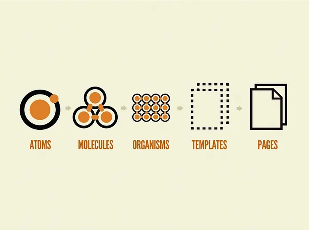
It conceives web interface design as a cohesive whole and at the same time, a collection of parts, since it is composed of smaller units, called atoms that, being reused and combined, generate larger elements, which are parts of the design of a digital product (Brad Frost).
Atoms are the basic unit, they cannot be divided into other units but are meaningless if they are not part of a larger system and compose the most elementary blocks of a user interface. Examples: icons, the headline of a page, a button or the main image of a post. At the code level, they include HTML tags such as headers, images, paragraphs, buttons, form tags or tables.
Molecules are groupings of atoms that acquire new characteristics and function as a unit. They form simple interface components, such as a menu, a table or a search form. Through their reuse, complexity is eliminated, testing is facilitated and the graphical, structural and conceptual coherence of the interface is ensured.
Organisms are sets of molecules and atoms that create more complex elements. They are reused as headers, footers, a complete navigation menu or a list of elements. For example, a header contains molecules and atoms, such as a logo, main and section navigation, language selection or a search form.
ADVANTAGES
Using reusable components that are easy to test makes generating a page much more agile and collaborative, avoiding code errors and unnecessary repetitions. The solution is the generation of a set of standards and style guide, which becomes the basis of the design system (design patterns and defined styles, organized in a Pattern Lab or library of patterns and a style guide).
A WORKING MODEL FOR UX
Being a design system based on a flexible and scalable hierarchy, the use of Pattern Lab, an open source tool, helps and inspires the creation of style guides respecting the principles of Atomic Design and also allows testing variations of the same component with different characteristics: quantities added in the cart, length of titles, loading speed or screen resolutions.
A style guide is a collection of components and rules that everyone involved in web design and development must apply. Thus, all parts of a website or app will be coherent and provide a consistent and compact user experience across all interfaces. The style guide serves to document and organize the components by providing instructions and rules for their correct use, so it must be accessible, clear and easy to use.
IT MUST CONTAIN
Design and descriptions of the components.
HTML, CSS and JavaScript code of each component.
Visualization of the components with different resolutions and variants.
Real examples for the templates.
Information on proper usage.
In addition to improving the productivity of web developers by saving time and money, it favors collaborative environments and communication between the parties involved in the design system.